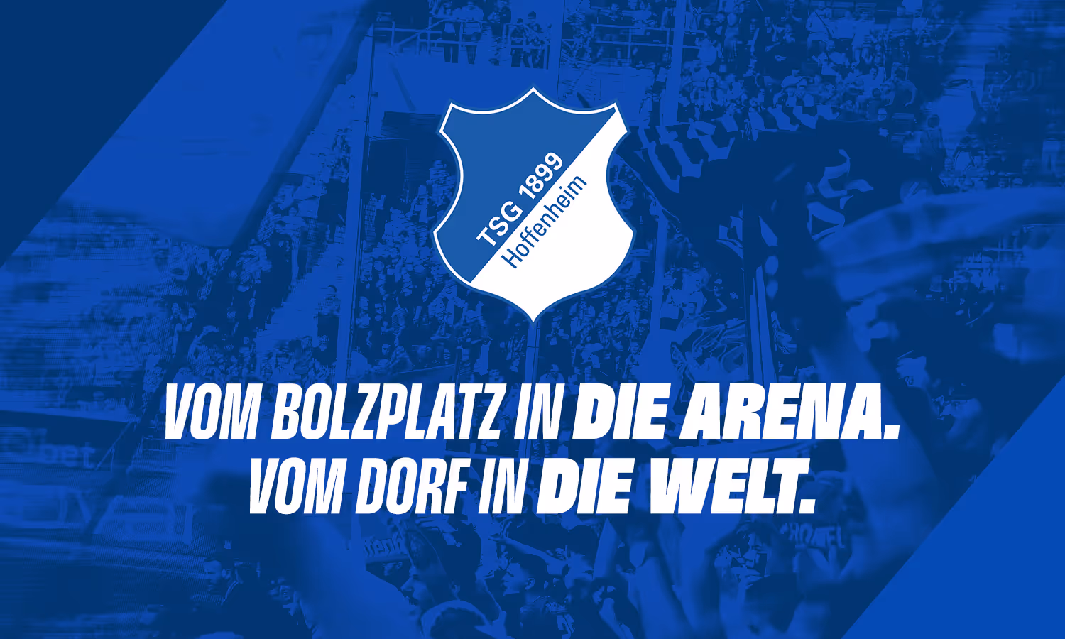
Small town club, passion for football, talent development and innovation leadership. These four pillars form the basis of the TSG brand and shape its new image: an authentic identity for the future.
THE HEART OF OUR CLUB
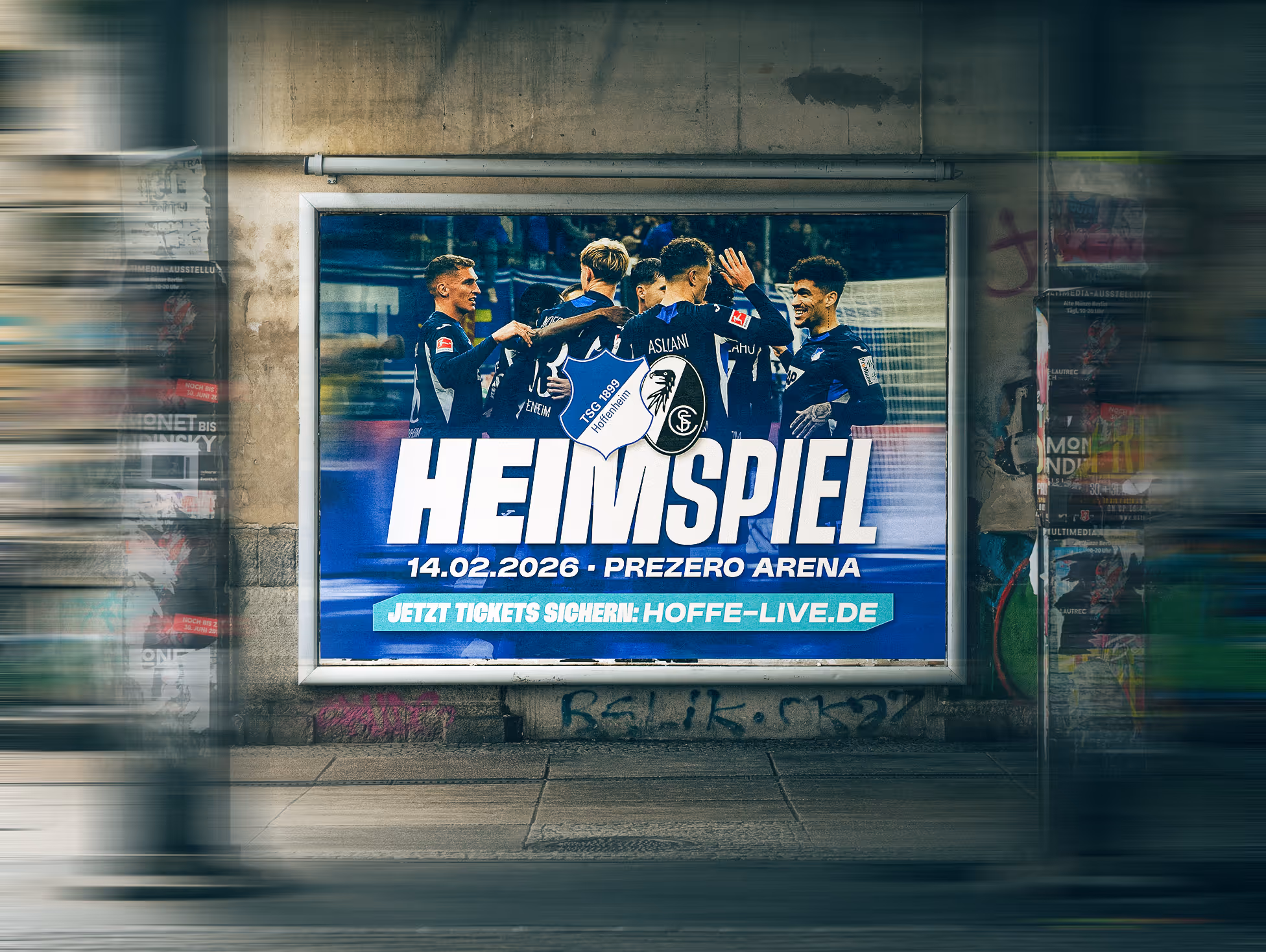
The club crest remains unchanged. It represents the identity of TSG and, with its unique shape, is a central element of the brand. The colours blue and white are represented in equal parts. Together, they symbolise the unity of the club.
MORE VIBRANT THAN EVER
Blue and white remain the distinctive colours of TSG. Three shades of blue create a familiar image, which has only changed in nuances. The palette is refreshed by new secondary colours: they are associated with the region and football and underline the connection to home.
UNMISTAKABLY ANCHORED
The design elements we have developed give our brand a unique character. Three new pattern elements and a modern icon package reflect the visual identity of our brand, ensuring a consistent appearance.
ROOTED IN THE REGION
The stag's antlers are inspired by the striking element of the Hoffenheim small town coat of arms. They form the basis for our new, contemporary design element. The abstraction of the basic shapes creates a versatile design element that can be used both individually and in a mirrored composition as a pattern. The stag's antlers combine the regional aspect with innovation and give the TSG brand a special visual identity.
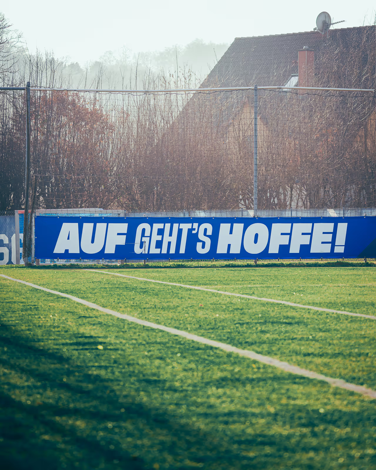
IT'S ALL ABOUT THE BALL
The ball is always the centre of attention – the hexagonal panel typical of football remains the unmistakable element across generations. TSG uses this as a symbol of its passion for football. Whether used individually or as a pattern, this flexible and dynamic design element emphasises TSG's identity as a football club.
FLYING THE FLAG TOGETHER
The sea of flags puts the fans, the heart of the club, centre stage. Inspired by the crest and the flags waving in the arena, an exciting new pattern has been created: it reflects the atmosphere and dynamics of a sea of flags. The flexible pattern visually expresses the lively connection between the club and its supporters.
WE SET THE STANDARD
The icons are characterised by the consistent use of the brand's signature angle, which shapes the brand's visual language. The bevelled contours create a strong connection to the brand identity and ensure a high recognition value. The icons thus blend harmoniously into the overall image of TSG. They underline the uniqueness of the brand.
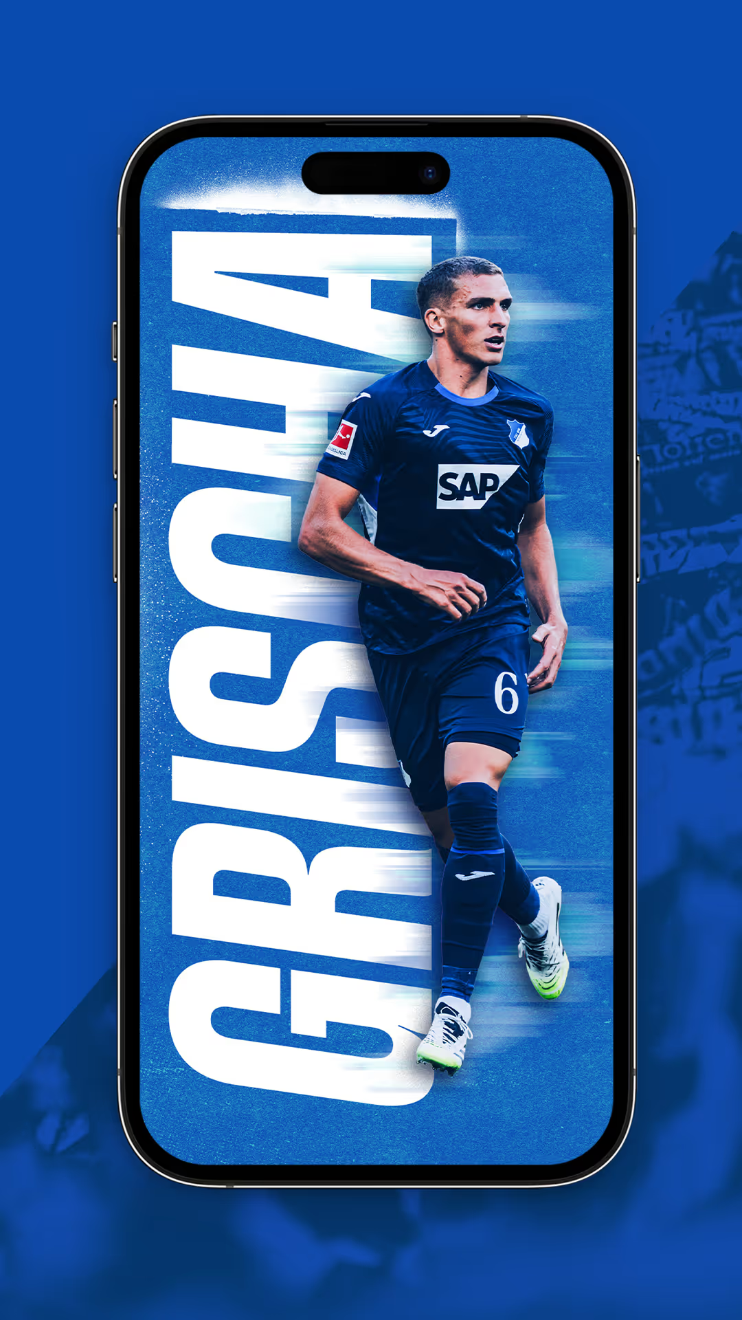
A TYPOGRAPHY WITH CHARACTER
With its wide range of flexible font styles, the Herokid font gives TSG an unconventional and dynamic character. This versatility fits perfectly with TSG's brand identity and supports an individual, powerful image.
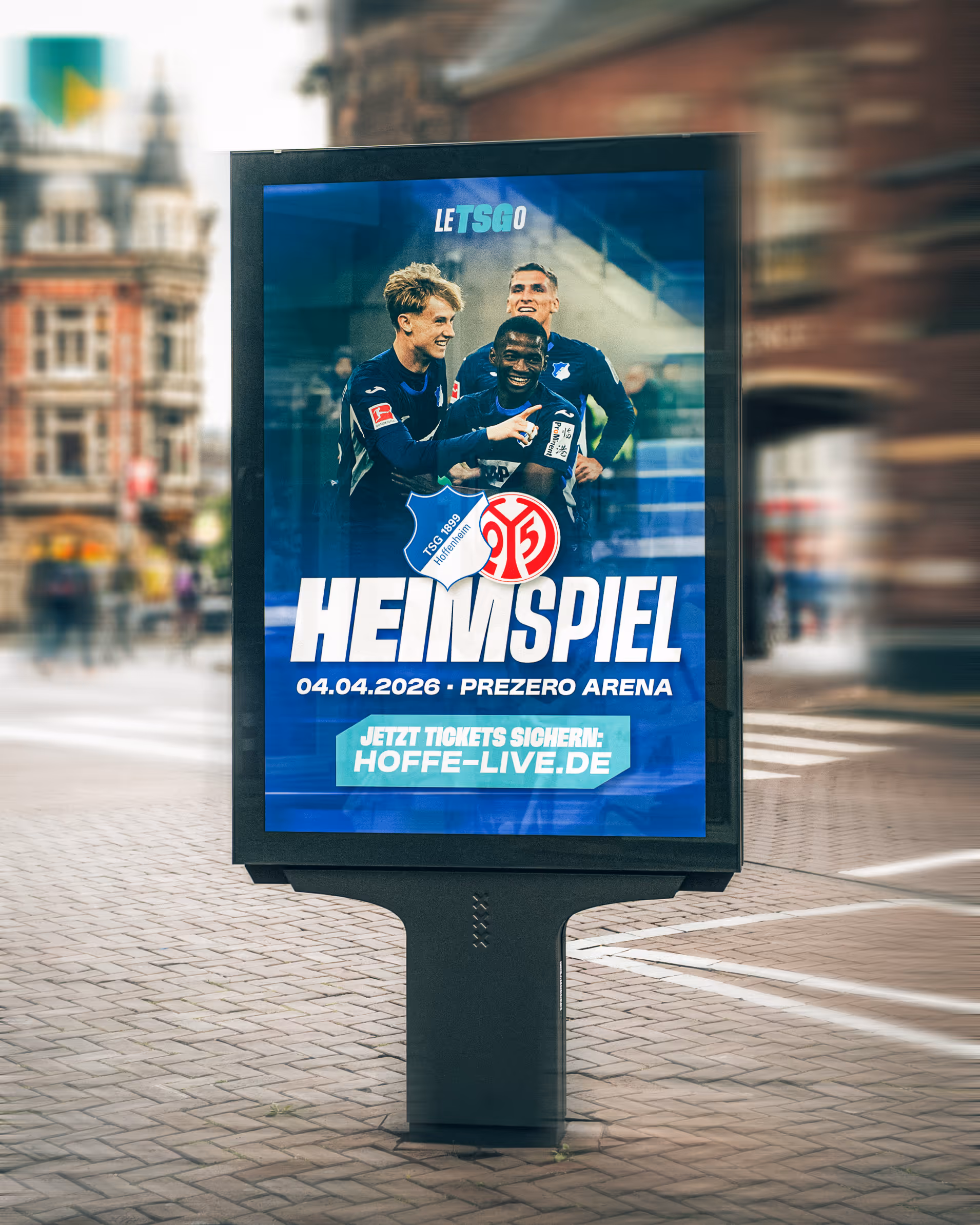
THIS IS HOW IT LOOKS
Whether it's visual language, the digital world or classic print products: TSG Hoffenheim's new look is both timeless and contemporary. The design stands for longevity, growth and development – just like TSG.